Sunday, June 21, 2015

Home Page & Navigation

Below is my portfolio website and navigation design. I decided to go with my second design, the stack of books with my monogram across the top. The stack of books are the navigation bars. I didn't want it to be too busy so that is why I left the background white and did the aqua gradient borders on the side. My goal was to keep the design clean and easy to look at. For me a website that is too busy looking turns me off. If there is so much going on you don't know what to look at.


I also wanted to include what one of the pages would look like if opened. So I included the "writing" page. As you will see below the thumbnails for each story are the outlines of books. Once you click on the book it will open that individual story. The arrows below the books shift the books to give you other stories. Below that is a little house shape which takes you back home to the main page.


Below are the images I used.


Sunday, June 14, 2015

Home Page & Navigation Sketches

My concept for my portfolio website is a simple classic book design. I am torn between a book stack and books in between book ends (as you will see in my sketches below). I find myself drawn to a more clean design so I am trying to keep things as clean as possible. The books will be the navigation buttons and there will be small social media icons on the bottom. I liked the idea of having my monogram on the top of the page, but if I go with the book end design I will use H for one end and C for the other, so there will be no need for my monogram at the top. I also have included a sketch for a mobile device (smart phone or tablet). Because the design is so simple I will most likely use bold colors.


Sunday, May 31, 2015

Avatar

Here is my finished avatar. This was definitely a challenge for me. I tried a lot of different things and then deleted them to try others. Starting off I had a very hard time finding a photo I liked that was a good resolution. I used liquify for the eyes, ears, mouth, and eye brows. I tried to reshape the neck a little too. I followed along with the provided tutorial as well as watching other videos on Youtube to try out other things. I must admit I had a lot of ideas that didn't work out or seemed a bit beyond my current skill level.


Below are the links to the photos I used:
http://dallasheadshotportraits.com/2010/10/29/dallas-model-test-shots-headshot-and-portrait-photographer/  
http://www.wallpowper.com/fall-wallpaper-1080p-forest/hd-forest-wallpapers-tera-wallpaper.html


Friday, May 22, 2015

Avatar Sketches

My concept for my avatar is an elf/fairy. The background will either be a forest or moonlight ocean background. I'm thinking blues, pinks, and purples for hair/skin/skin designs. Below are my three concepts for my avatar.


Wednesday, May 20, 2015

Book Cover Design

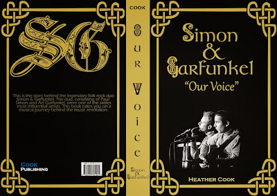
Below is my book design for "Our Voice", a fictitious book about Simon and Garfunkel. I wanted it to have a very folk look, since their music style was folk rock. I used a Celtic knot work banner for the front and back, and downloaded some Celtic style fonts.


Below are the images I used.
http://www.clker.com/clipart-celtic-frame.html
 
http://firewireblog.com/2010/05/27/acers-lumiread-e-reader-scans-books-isbn-codes-to-find-digital-versions/
 
http://www.moosevilleusa.com/vinyl/featured-artist-simon-garfunkel

Sunday, May 17, 2015

Book Cover Sketches

I chose to do Simon and Garfunkel for my book design project this week. Simon and Garfunkel were an influential folk rock duo in the 60s. So, below are my three different ideas for the book cover, back, and spine. I'm not sure which one I will go with yet (or if it'll be a combination of the three), but I know I want to keep it fairly clean and simple with a very peaceful vibe.


Saturday, April 25, 2015

Child Abuse Awareness Poster

I chose to go with my first concept, and kept it fairly clean and simple. I used a photo of a child reflected in a broken mirror. This is symbolic of the child looking at their broken or shattered life. I also used a photo of some broken glass and added text to it. The text is for things that are taken away from a child when they are abused. They no longer have security, they lose hope, and a sense of joy and love in their lives. All of the broken glass is to show that you are not only hurting your child in that moment, but shattering their whole life -- present and future.


Here are links to the two photos I used:
http://www.freeimageslive.co.uk/files/images006/shattered_mirror.jpg
http://images5.fanpop.com/image/photos/28000000/Child-Abuse-stop-child-abuse-28011054-1600-1200.jpg